Why Purple? Red - Blue Election Maps are All Misleading
A Sea of Red!
This election map from 2016 makes it look like this is really a RED country, with a few isolated BLUE areas. You could walk from sea to sea and never step out of a red county.
This view makes Republicans ecstatic and get Democrats very depressed.
But clearly, this map is misleading since the popular vote was nearly tied, with Hillary ahead by a few million.
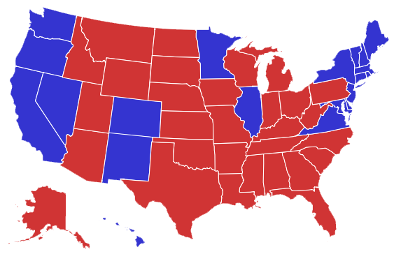
Red State Landslide!
If you go state-by-state you get a different result, but still not accurate, since there are plenty of blue voters in red states and vice-versa.
Cities versus Country
This map shows the votes by population and makes it clear than we have a strong urban versus rural split, but this map is also misleading because it indicates that there are no red voters at all in the cities, and no blue voters in the countryside, which is not true.
The Most Accurate View
This map shows that in every state the vote was divided between red and blue, with a few for Gary Johnson, mostly forgotten.
If you run your cursor over the map at the left it goes out of focus and pretty much… turns purple.